| |
should say something strongly enough to get
someone to do something.
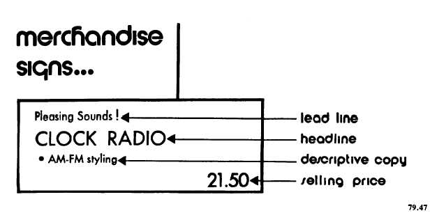
There are four basic components in the
development of signs that include the important
elements mentioned above. Refer to figure 6-1.
1. The lead line attracts the patron’s attention.
a. It can be one word or a phrase.
(NEW!) (GREAT GIFT IDEA!)
b. It should be in bold type if it denotes
SPECIAL EVENT, CLEARANCE, or SALE.
c. It should be printed in red for greater
emphasis when
it denotes REDUCED,
CLEARANCE, or SPECIAL merchandise.
d. It should contain a lighter type face for
general or regular information.
2. The head line names or identifies the item.
a. It should be in bold face or large type.
b. It should be the largest type on the sign.
c. It should use as few words as possible.
3. The descriptive
information (or copy)
inspires a patron’s desire to buy the merchan-
dise.
a. It should be set in a different type
from that used in the lead line.
b. It should be set in type that is the
same weight as the type in the lead line.
c. It should be no longer than two lines
of type.
d. It can use bullets (.) to eliminate
wordiness.
e. It should not compete with the head line
for prominence.
4. The price information should complete the
sale.
a. It should be clearly stated in bold type—
as bold or bolder than the head line with no dollar
sign ($) when cents are included in price (print 1.75
not $1.75).
b. Print $25—not $25.00 when no cents
are used.
c. Be specific (print 1.95 to 5.95 not 1.95
and up).
d. Use the symbol for cents (¢), not the
decimal, when the price is less than one dollar
(print 80¢ not $.80; print 70¢ to 1.25). (Always
print the lowest price first.)
e. Include the unit of measurement (gal.,
qt., dz., ea.) with the price to avoid confusion.
f. Avoid broad spreads in the price ranges
(print 1.95 to 5.95 not 80¢ to 8.95).
g. Use the phrase priced as marked when
a range is very broad.
In summary, if you and the other ship’s store
personnel are conscientious about trying to im-
prove the visual impression of your ship’s store,
there are a variety of possible sources of infor-
mation and materials that you can use.
SHIP’S STORE OPERATION
The proper and effective operation of the
retail outlet(s) of your ship’s store operation is
an extremely important job. As a senior Ship’s
Serviceman, you must not only maintain proper
control of the operation but you must also
Figure 6-1.—An effective selling sign.
6-6
|

